Consumer SocialCase study · 2024
Potluckey
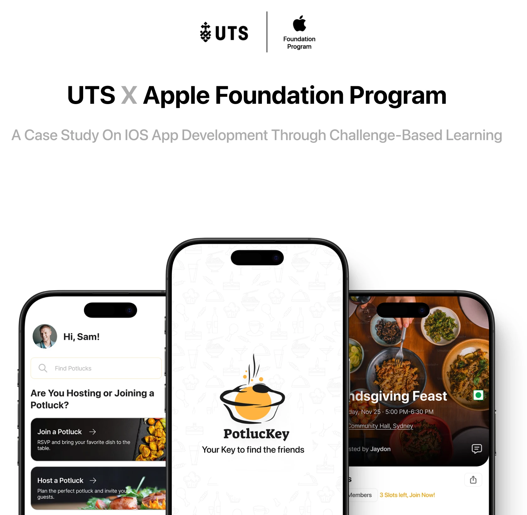
Potluckey helps international students find their people through the food they share. Designed and built end to end in three weeks during the Apple Foundation Program at UTS, and presented at the Apple Foundation x UTS Startups Showcase.
Context
The Apple Foundation Program at UTS, a challenge-based learning sprint where I was selected as one of 30 students from across all faculties and UTS Startups. Three weeks in November 2024, a team of five, from research through design to a working build.
My role
Interaction design, visual design, the pitch deck, and iOS development in SwiftUI. I was the only designer on the team.
Outcome
Potluckey, a functional SwiftUI app built in three weeks and presented at the Apple Foundation x UTS Startups Showcase in front of Apple executives and industry leaders.
Potluckey is an iOS app that helps international students find their people through the food they share.
The idea
International students often struggle to make friends when they first arrive in a new country. Language barriers, cultural differences and a missing social network all stack up, and the usual social events rarely produce a genuine sense of community.
Potluckey bridges that with something tangible. You join a potluck and bring a dish, or you host one and open your table. The food carries the conversation, and the cultural exchange comes free.
The app, in three stories
The three user stories we built, walkable screen by screen. Tap the phone or use the arrows.
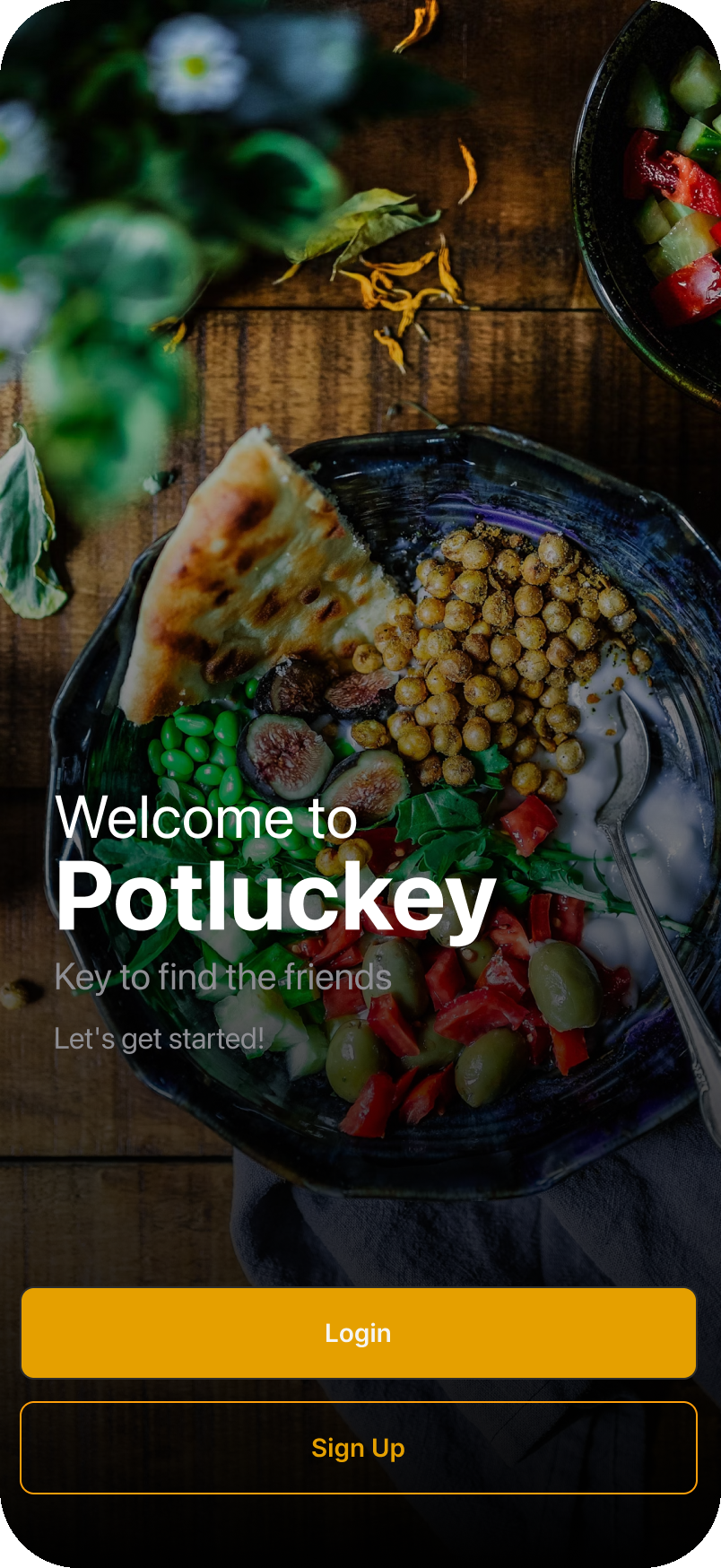
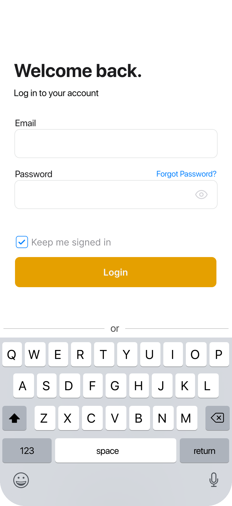
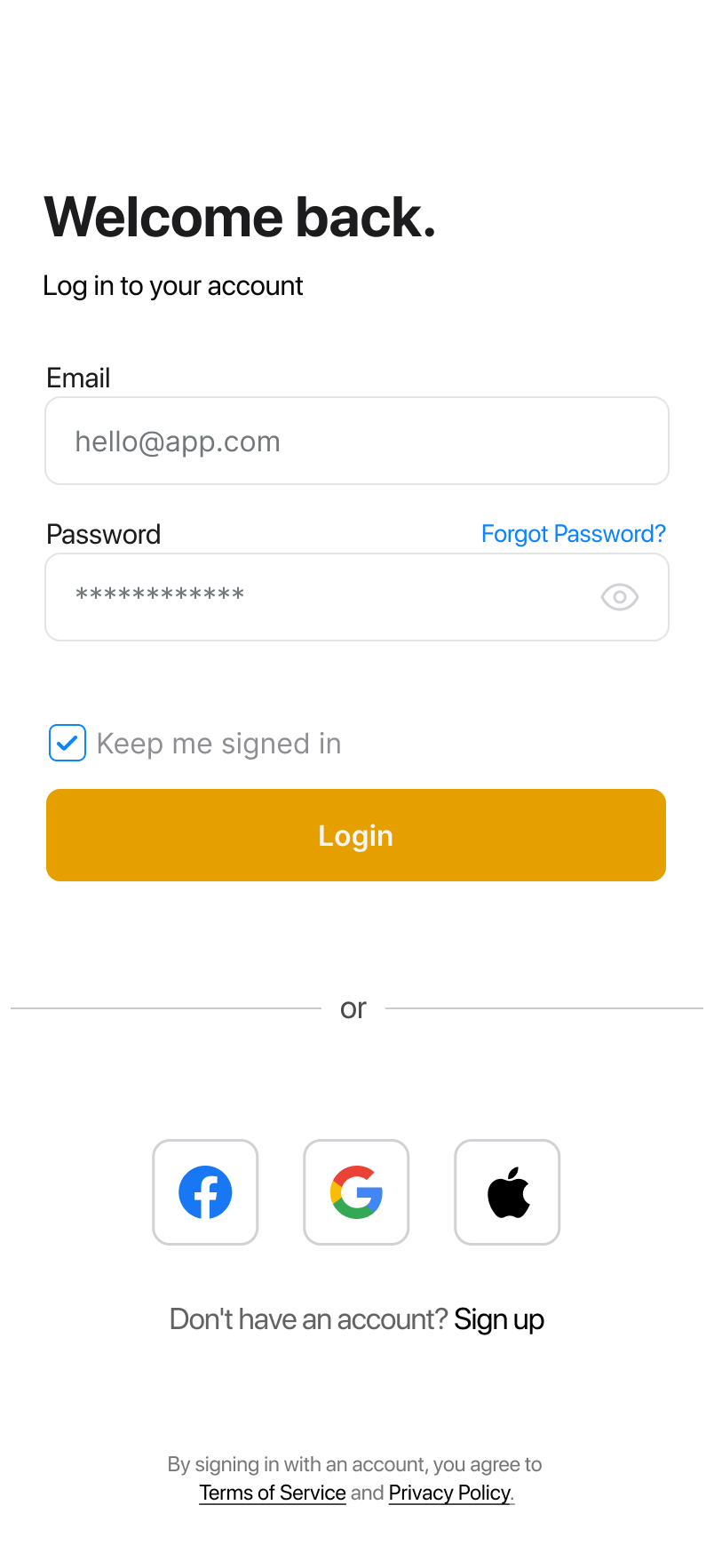
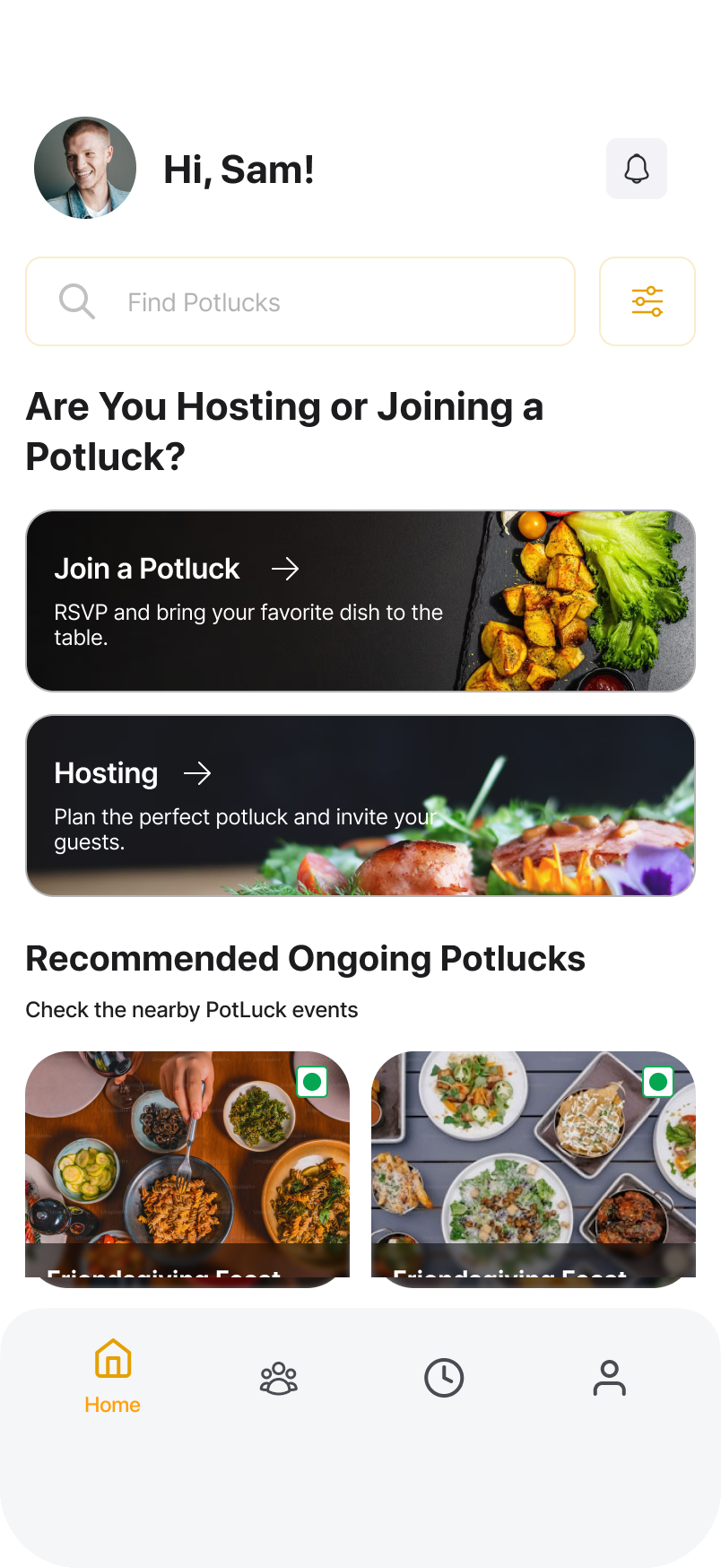
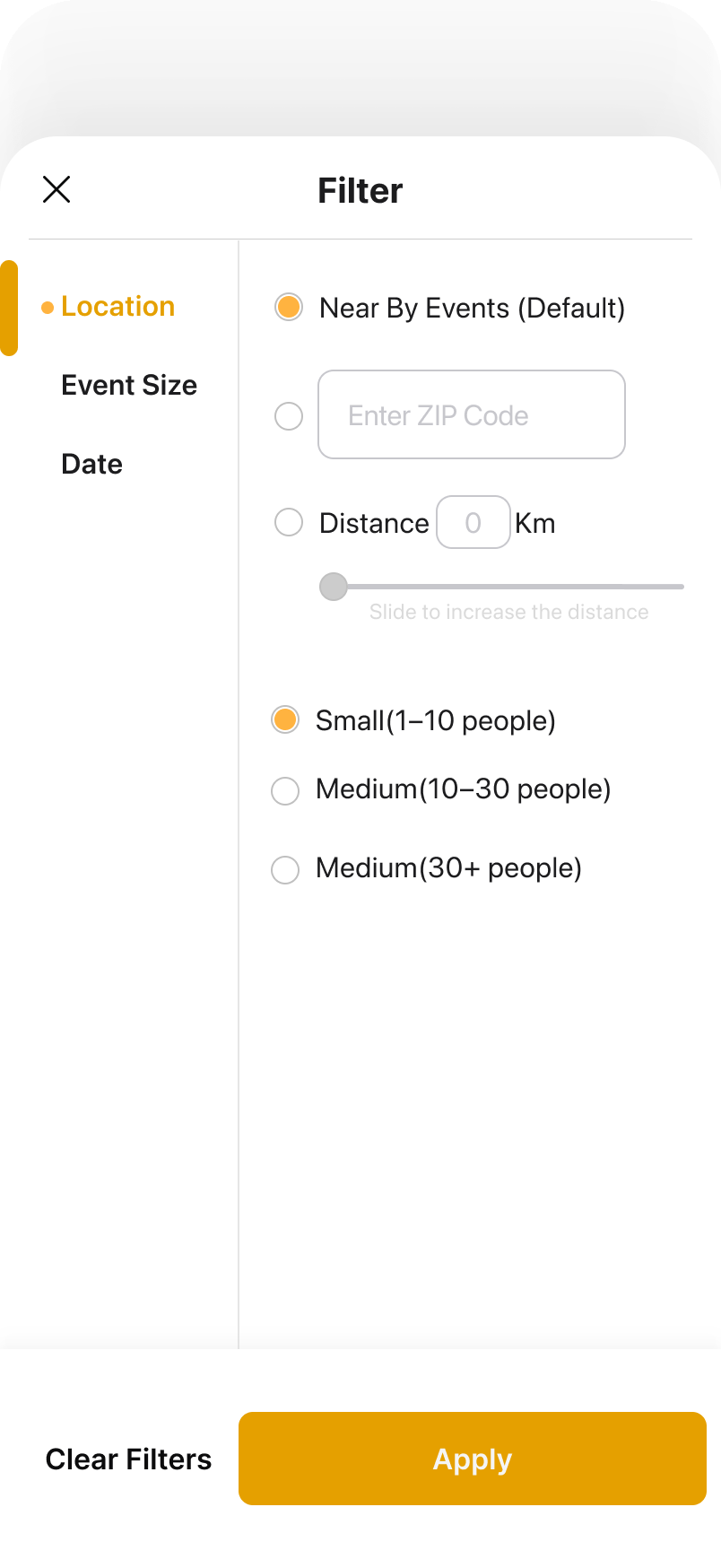
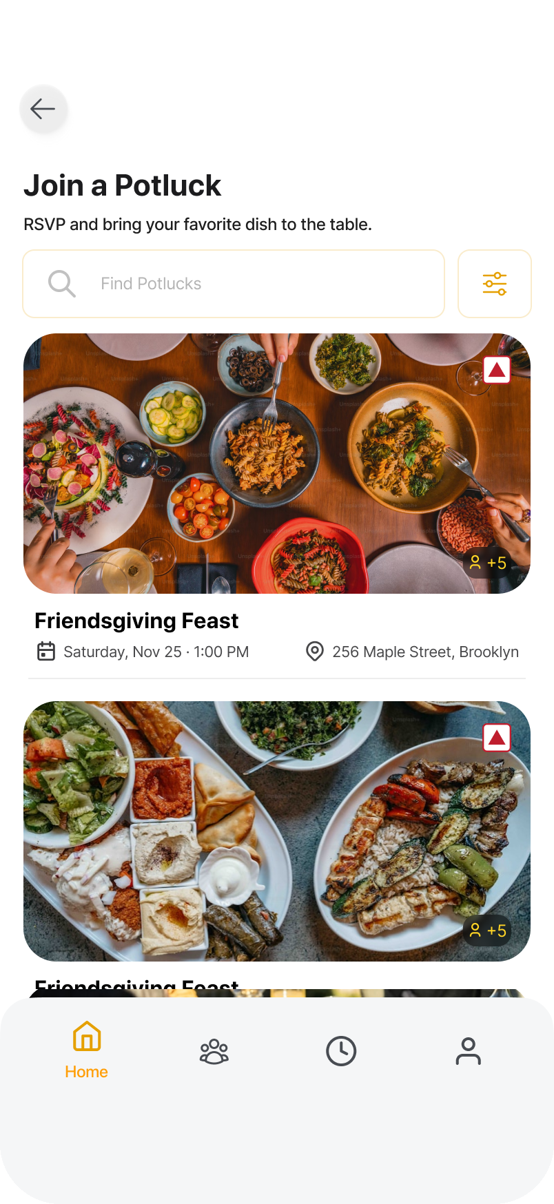
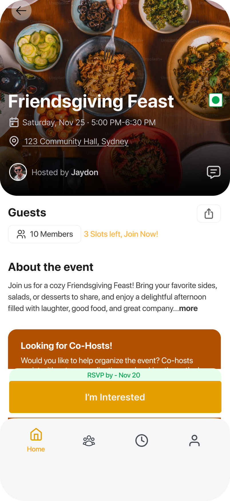
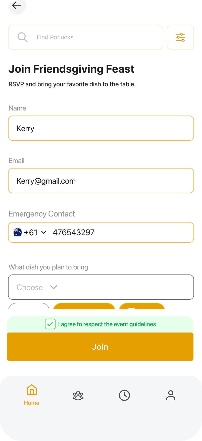
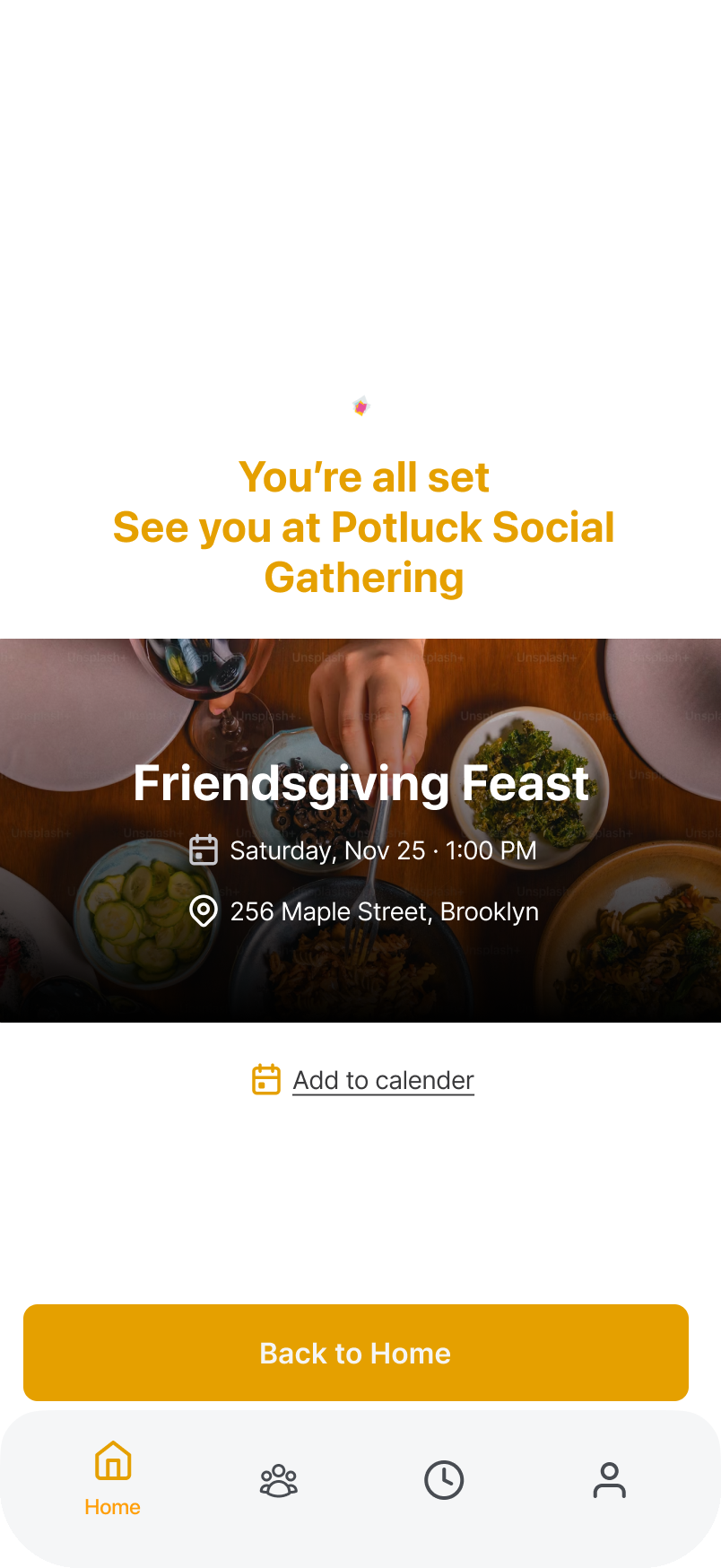
“As an attendee, I want to easily find potluck events that match my interests.”
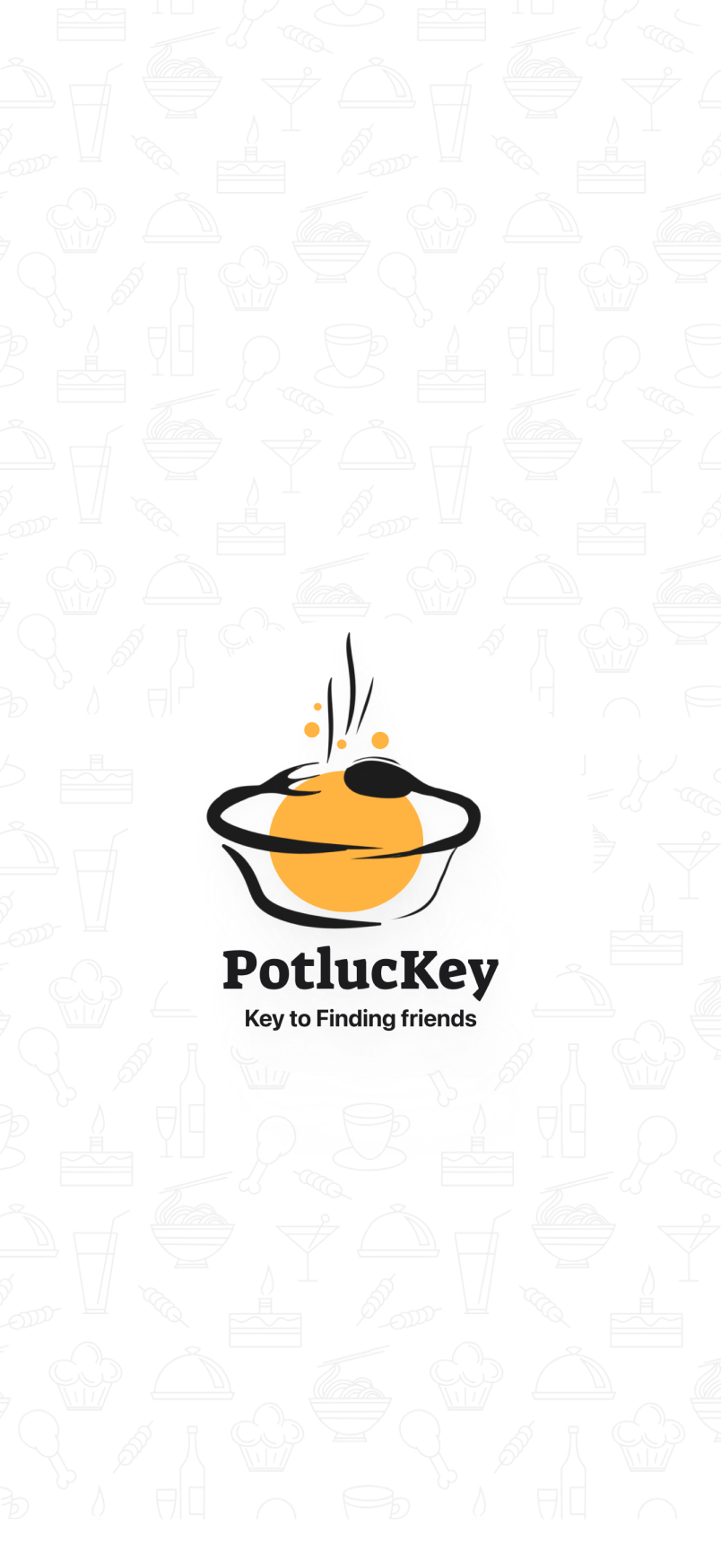
The splash. The PotlucKey mark on a field of food doodles, and the one line that carries the app: your key to find the friends.
The twenty days
The program structures the sprint into three phases: Engage (days 1 to 2) to land on a challenge, Investigate (days 3 to 18) split between research and design and development, and Act (days 19 to 20) for the pitch and the post-mortem. Twenty days is not long to go from nothing to a working app, and that pressure shaped most of what follows.
The question we started with
We opened with a team brainstorm where everyone brought their core ideas, distilled into themes like culture, animal welfare and sports. A mapping exercise surfaced the shared thread: traditions. Structured questioning (how, what, why, who) and a round of voting crystallized the Essential Question we would carry into research:
What do we need to consider about traditions?
The pivot
Our first framing was about fostering “traditional relationships,” a concept we believed could connect people across cultures. Then we took it into surveys and interviews, and the term fell apart: some read it as outdated, others as romantic relationships from another era.
We kept the goal of connection and changed the medium. Food emerged from the research as the most immediate and universal way in, especially for international students navigating a new cultural landscape. That reframe became Potluckey: a platform built around shared culinary experiences, personal and relevant in a way the original framing never was.
Stepping up under pressure
Designing Potluckey was not a linear journey. Unforeseen circumstances kept me away from the initial UI sprint, and the team's early prototype, despite their best efforts, missed the vision. It lacked coherence and usability, and a major review was hours away.
When I returned I redirected the course: using frameworks I had developed earlier, I reimagined the prototype in about twenty minutes. Still work-in-progress, but it immediately resonated with what we were trying to build. From there, mentor feedback and quick testing sessions within the cohort refined it iteratively into the design that stuck, one people kept describing as simple and warm.
Building it in SwiftUI
With three weeks total, our three developers (me included) merged design and development instead of running them in sequence. We broke the work into focused tasks:
1Event discovery and details views
2User interest screen
3Search, filtering and data handling
4Navigation, icons and graphics
5Event images and color palettes
For the more complex logic we leaned on generative AI to accelerate the build. The goal in this phase was blunt: as many fully functional screens as possible before pitch day, without letting the design's fidelity slip. The result was a working prototype that carried the essence of the vision inside the deadline.
Showcase day
Our project was presented at the Apple Foundation x UTS Startups Program Showcase, in front of Apple executives and industry leaders. What started as an idea three weeks earlier was now something tangible we could proudly hand to people.
Hearing positive feedback from such experienced leaders made the late nights and hard decisions worth it. It was a celebration less of the product than of how far the team had come.
What stuck
You do not truly understand collaboration until you have debated, compromised, and still delivered. Our team spanned a high school graduate, a bachelor's student and an older couple, mostly without design backgrounds, and the differences showed up in real decisions. I designed a checkbox with accessible colors; the team preferred a scheme that failed accessibility standards. Explaining the reasoning behind the choice resolved the conflict and pulled everyone closer to the design process itself.
The biggest debate was the logo. A teammate generated one with AI; I had spent hours refining mine around the app's purpose. Instead of just showing my design, I walked through the thinking behind every element. The team went with it, and the lesson has outlasted the project: advocate for your vision, and back it with reasoning rather than preference.
And SwiftUI. Building the app myself changed how I design. The learning curve was steep, but I now think about feasibility and development constraints while designing, which makes collaborating with developers a very different conversation.
The reasoning behind the three screens that matter most, pinned where each decision lives. Tap a pin to read it.
Home
The first screen after login. Four decisions live on it.
Home, annotated4 decisions live on this screen. Tap a pin, or step through them here.
Event details
The screen that turns browsing into joining.
Event details, annotated4 decisions live on this screen. Tap a pin, or step through them here.
One more decision sits below this crop: the You Can Bring section, which turns the open question of what to bring into a few visual categories.
Attendee profile
The people layer: who you are actually meeting.
Attendee profile, annotated4 decisions live on this screen. Tap a pin, or step through them here.